I grew up outside. I lived in a house full of Ironman triathletes who considered a day that didn't have at least one bike ride, run, hike, swim, or tent in it to be a waste. While I may not be quite as extreme, I've come to appreciate being outside as a necessity in my life.
But enough talk about feelings, you're here for the data.
A few months ago, I purchased a Garmin Forerunner 235 and have since been using it to track everything I do outside whether that's running, biking, hiking, or even one time, golfing. The watch tracks my GPS location as well as heart rate and information about my movement every second. I wanted to take this data and be able to see it all at once, and I thought the best place to start would be to plot it on a map (duh).
Step 1: Extracting the Data
Garmin allows exporting of individual activities in one of two XML formats: tcx or gpx. The former is their custom XML format including almost every measurable data point recorded each second whereas the later is a standard format that contains only information with GPS coordinates and elevation. I chose to use the first format for the sake of retaining as much data as possible. Here's a sample tcx file from the 76 mile El Tour De Tucson race I did in early November.
The XML follows a fairly simple structure where the activity contains a series of 'lap' elements with children elements summarizing the lap as well as a series of children 'trackpoint' elements which capture the second by second information recorded by the watch. Thus, the Java code to read the XML file was equally straightforward.
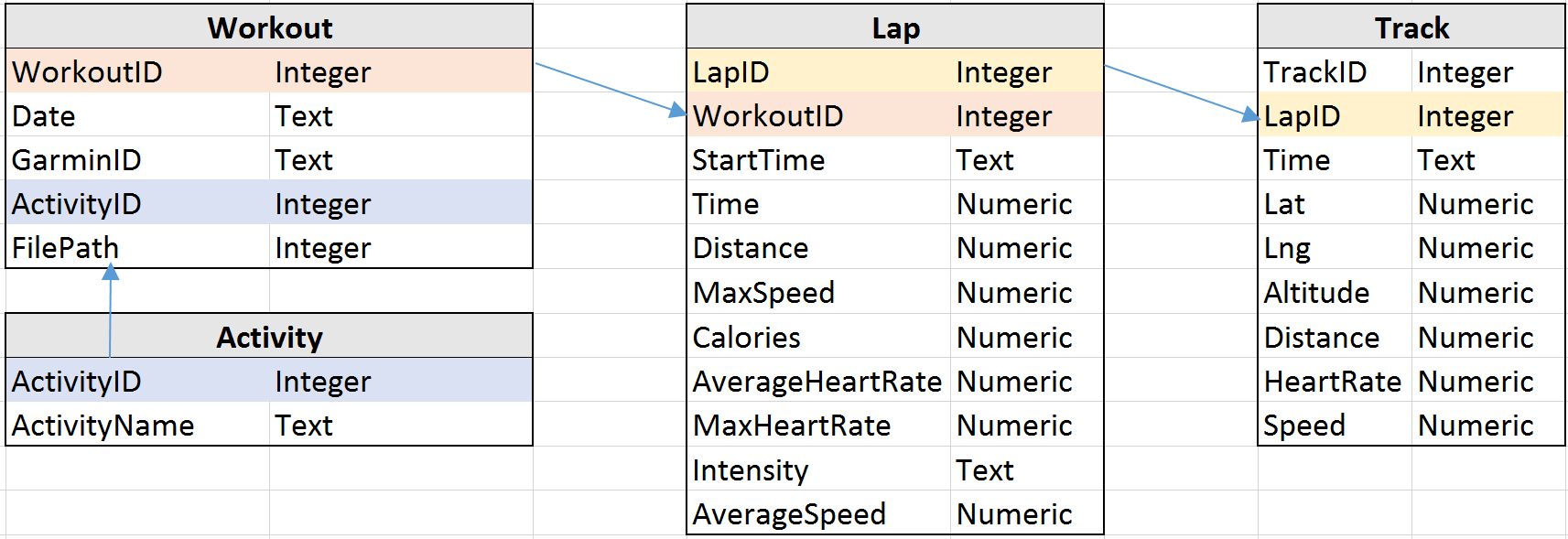
I stored all of the data in a very simple SQLite database using DB Browser for SQLite with a schema that mirrors the exact same structure I've told you about twice now.
From there, all that was left on the data front was exporting the data into a format that I could use on the web. I found an easy to use package for creating JSON files called json-simple that handled everything I needed. At this point I made a simplification and only exported the GPS coordinates for every five seconds of activity simply to reduce the file size and download time (50 tracked activities was approximately 10MB if every data point was used).
Step 2: Adding the Data to Google Maps
Google Maps has an absolutely fantastic javascript API. What I thought would be the hardest part of the project turned out to be surprisingly straight forward. After requesting a key, I had a simple map up and running in no time. I created a custom style for the map, figured out how to draw generic lines (which didn't have any problem handling thousands of points), and added markers for the start and end of an activity. From there, I was able to add event listeners to make the map as interactive as my heart desired. Hovering over an activity will update the details section of the bottom of the map while accenting the activity route. The markers at the top of the map filter out activities based on their type while recalculating the aggregates at the bottom of the map.
Step 3 - 929012: Make it even more Interesting
Since steps 1 and 2 were so straightforward (seriously it took only a few days), there's a whole world of possibilities out there for what's next.
One of the most glaring omissions from the Garmin website is a way to compare activities side by side. This would be especially useful for examining how you improve over time on the same routes. A side by side analysis where you could track your distance, speed, and heart rate live on a map through animation or gradient paths could quantify months of hard work through a visual and meaningful representation.
This is one of many paths that I'm considering taking this project down next.